Email Design: A Buyer's Guide to Layouts and Styles
Key Takeaways
- Choose a style around the campaign’s main action. A newsletter and a product promotion shouldn’t compete for attention in the same way.
- Compare templates using your actual copy and brand assets. Short placeholder headlines hide editing problems.
- Buy an editable production system, not just an attractive mockup. Confirm who handles HTML, image hosting, testing, and future changes.
- Send a test through your actual sending platform before approving the design. A browser preview can’t confirm inbox compatibility.
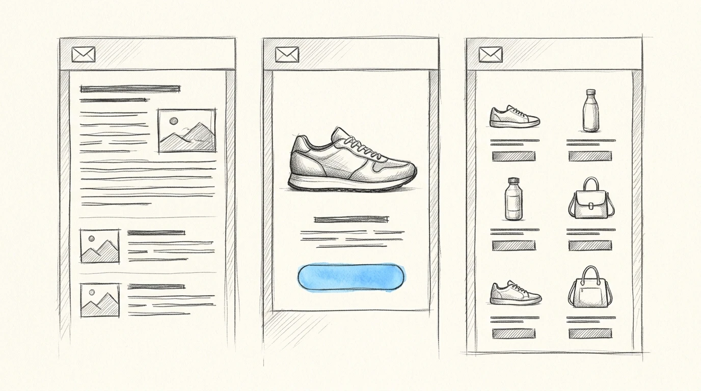
Email design should match what you’re asking the reader to do. Choose an editorial style for reading, a product-led style for a focused offer, or a catalog for browsing. Email clients render HTML differently, so judge every option by its delivered result, brand fit, and editing effort before you commit.
What should you judge before choosing an email design?
The right design makes your message easy to understand and practical to produce repeatedly. I’d assess options against message fit, brand fit, and maintenance effort, then treat inbox compatibility as a requirement rather than a bonus.
Start with the action. A founder announcing a feature might want readers to activate it. An agency’s monthly update might need readers to scan several stories and choose one. Those are different jobs, even if both campaigns use the same colors and logo.
For brand fit, look beyond whether you can change the accent color. Check how the design handles your typography, photography, and writing style. A restrained consulting brand can look unrecognizable inside a template built around oversized promotional badges.
Maintenance is where an attractive purchase can become expensive. Ask whether a marketer can replace a headline without moving other elements, whether optional sections can disappear cleanly, and whether changing a button requires developer help.
Test with your hardest realistic content. Paste in a long product name, an announcement without a photograph, and the amount of copy you actually send. Good email templates survive normal variation without requiring you to redesign the campaign.
Which visual style fits your campaign?
Choose the style that supports how readers will use the message. The comparison below gives you a starting point for email marketing design, rather than a ranking of which style looks best.
These are practical design judgments, not measured performance scores. Copy the table and fill in the last column for a template or proposal you’re considering.
| Decision criterion | Editorial | Product-led | Catalog | Personal letter | Your option |
|---|---|---|---|---|---|
| Best reader action | Read or select a story | Act on a focused offer | Browse several products | Reply or follow a direct link | |
| Visual brand expression | Moderate | Strong | Strong | Restrained | |
| Dependence on imagery | Low to moderate | Moderate to high | High | Low | |
| Ongoing editing burden | Moderate | Low with reusable sections | Higher as products change | Low | |
| Main weakness | Stories can compete | Secondary messages feel squeezed in | Products can receive equal emphasis | Complex offers become text-heavy | |
| Best fit | Updates and educational content | Launches and promotions | Assortment-led campaigns | Founder notes and relationship emails |
Editorial: choose it when the content earns attention
An editorial style uses headings and short summaries to help readers choose what to read. It suits a service business sharing a useful explanation alongside company news.
Give the lead story more emphasis than routine updates. Skip this style for a time-sensitive offer if the extra stories would distract from the action you need.
Product-led: choose it when one offer matters most
A product-led style puts the offer and its call to action ahead of supporting detail. For a software launch, that might mean a benefit-led headline, a brief explanation of the change, and a button labeled “Activate your workspace.”
The risk is unnecessary decoration. If the message needs a long image-production process every time you send, the design may recreate the very designer dependency you wanted to remove.
Catalog: choose it when browsing is useful
A catalog gives several products a consistent presentation, making it easier to compare items within the message. It suits a retailer introducing a collection when readers genuinely benefit from seeing the assortment.
Skip it when one product deserves the sale. Equal-sized product blocks can make a clear priority look like an undifferentiated shelf.
Personal letter: choose it when the sender is the draw
A personal-letter style uses restrained formatting and a readable flow of text. It can suit a founder explaining a pricing change or a freelancer reconnecting with past clients.
Keep the production honest. A heavily formatted promotion disguised as a personal reply can create a mismatch between what the reader expects and what the message delivers.
When collecting email design inspiration, save examples by the problem they solve: explaining an unfamiliar offer, presenting choices, or inviting a reply. Copying a palette won’t reproduce the reason an example works.
Should you use a template, an AI designer, or custom work?
Use a reusable template when the campaign structure stays stable, an AI designer when you have copy and need flexible visual production, or custom work when the requirements justify specialist attention. Judge each route by the work left after the first draft.
| Production route | Choose it if | Skip it if | Confirm before committing |
|---|---|---|---|
| Reusable template | Your campaigns share a predictable structure | You regularly need substantially different sections | Editing rights, removable modules, and reusable assets |
| AI-assisted design | You have approved copy and want to refine the presentation conversationally | You need unsupported interactions or strict code-level control | Copy preservation, export format, and revision controls |
| Custom designer or developer | You need a distinctive system or unusual requirements | Your brief is still changing and you need immediate production | Deliverables, testing scope, handover, and maintenance |
| Self-coded HTML | You can maintain email-specific markup and test it | Nobody owns ongoing compatibility fixes | Supported clients and a repeatable testing process |
The best email templates reduce recurring decisions. They establish reusable spacing, button treatments, and section patterns while leaving room for your content. A large template library offers little value if every campaign still needs structural repair.
Custom design deserves a closer look at the handover. A visual source file and a production-ready email are separate deliverables. If your designer supplies a mockup, the Figma to HTML email guide explains the conversion step, which you should include in the scope before approving the work.
Compare total effort, too. Include asset preparation, implementation, revisions, and testing when weighing a template purchase against custom work. A cheaper starting point can require more hands-on production.
What should your design brief include?
An email design brief should describe the reader’s task, the content constraints, and the files needed for sending. “Make it look premium” gives a designer or generator very little to work with.
For a founder’s product announcement, a useful brief might read:
Campaign: Product update for existing customers
Primary action: Activate the shared workspace
Preferred style: Product-led, with restrained branding
Copy rule: Preserve the approved copy word for word
Brand assets: Use the supplied logo, colors, and writing samples
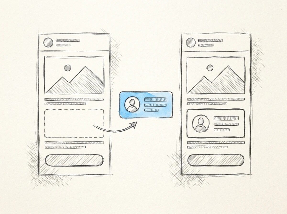
Optional content: Remove the customer quote section when absent
Delivery: Editable design plus HTML for our sending platform
Acceptance: Links, required footer content, and agreed inbox tests pass
Replace those fields with your campaign details before requesting proposals or generating a draft. Include who approves changes and who owns the finished files.
For agencies, specify which assets belong to which client project. Re-entering logos and colors creates unnecessary work, while reusing the wrong client’s assets creates an approval problem that no polished layout can fix.
Keep the main action clear, use a mobile-friendly email layout, and agree on a concise header and a footer that contains the required sender details. Those requirements belong in the brief even when the visual style changes.
What must pass before you approve the finished email?
Approve the email only after its content, accessibility, and sending behavior have been checked. A beautiful screenshot proves very little about the message your subscribers receive.
Start with readable text and a clear action. Keep essential information as live text rather than embedding the entire campaign in an image. For color choices, W3C’s minimum contrast guidance specifies a contrast ratio of 4.5:1 for normal text and 3:1 for large text.
Check the experience when images are blocked and when dark mode changes the appearance. Use descriptive alternative text where an image carries meaning, and make sure the offer remains understandable without it.
A browser preview is useful for catching obvious spacing problems. You can inspect the exported file with an HTML Email Previewer, then send through your actual platform and check the inboxes your audience uses, including relevant Outlook versions.
Watch the delivered HTML size. Mailchimp documents Gmail clipping messages larger than 102 KB, which can hide content at the bottom. If the markup is bloated, an HTML Inliner & Minifier can help prepare it, but retest the output and the version processed by your sending platform.
Finally, test every destination and confirm that required unsubscribe and sender information remain intact after import. For US commercial email, the FTC’s CAN-SPAM compliance guide explains the requirements, including a valid physical postal address and an opt-out mechanism.
Frequently Asked Questions
Can I use a free email template for commercial campaigns?
Yes, if its license permits commercial use. Check whether attribution is required and whether the license covers modifications or client work before adopting it as your reusable template.
Should my email look exactly like my website?
No. Carry over recognizable brand elements, but simplify interactions and typography for inbox use. Website navigation, custom fonts, and elaborate effects may need email-safe alternatives.
Does a well-designed email improve deliverability?
Design alone can’t guarantee inbox placement. Authentication, sender reputation, list quality, and recipient behavior also matter, so keep deliverability checks separate from visual approval.
How do I measure whether a new design works better?
Choose a metric tied to the campaign’s purpose, such as completed purchases, activations, or replies. Compare versions with the offer and audience held as consistent as practical, rather than crediting the design for every change in results.
For your next product announcement, choose the style and complete the brief before opening a template gallery. With Bardiah, you can store brand assets per project, paste approved copy without changing its wording, refine the design conversationally, and export responsive HTML. If you have a question about that workflow, get in touch with the campaign you’re trying to build.